Energy healing is an exploding market, with many practitioners running solo businesses and relying on social media for lead generation. My challenge was to create a brand that would set Crystal Garden apart in a crowded digital space, while imparting a sense of calm. In other words: Be different but don't be loud.
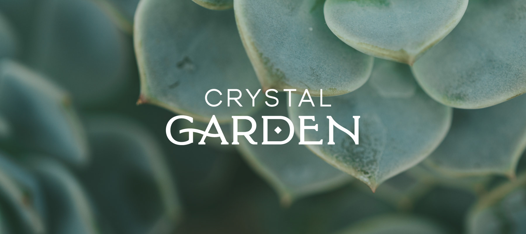
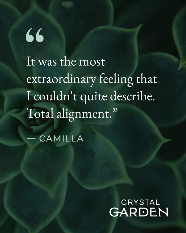
The echeveria plant is the primary motif I used across all brand materials to embody the Crystal Garden mission. It works visually because its petals are green, lush and alive but sprout in strict rosette patterns with a crystal-like geometry. It works spiritually because succulents represent strength and perseverance, crucial to the process of healing.
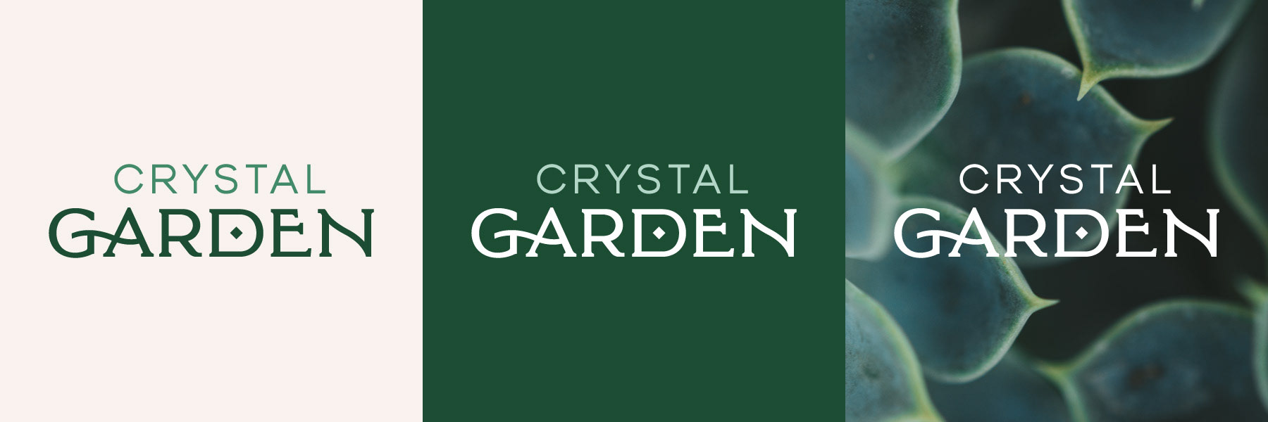
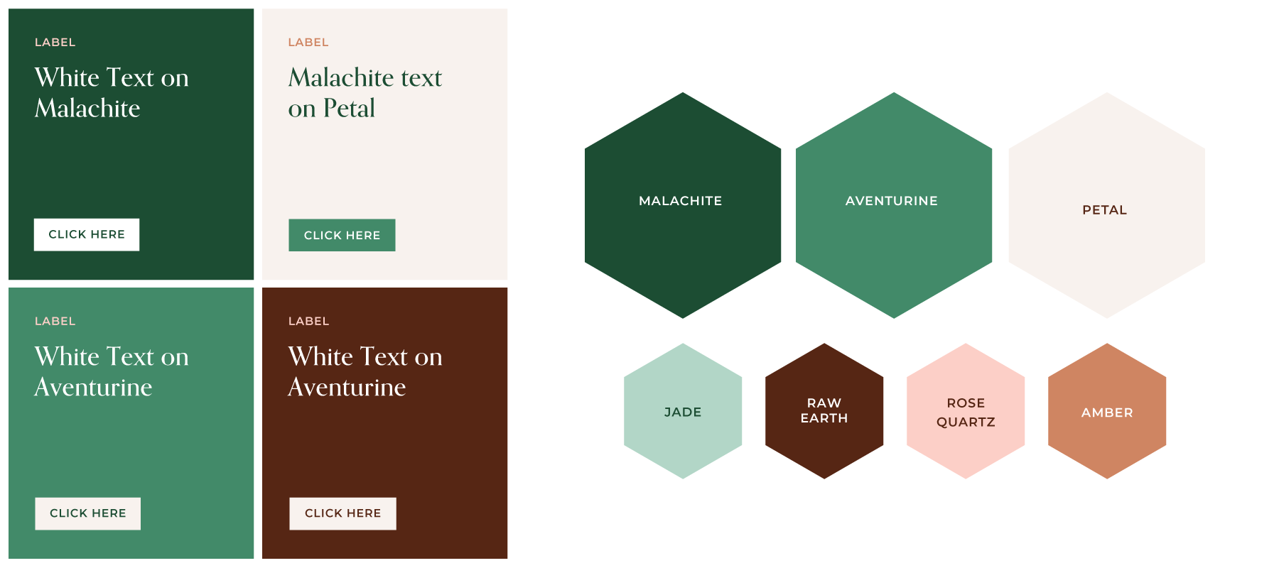
For the logo I created an elegant but sturdy word mark; whimsical but not overly soft or childish. The primary colour palette is earthy and subdued, but includes warm jewel tone accent colours for a feminine touch.